

How to make vast amounts of data easily read and understood by an audience? With the use of infographics. Infographics enable complex data to be effectively communicated due to its visual format, making it easier for the viewer to draw conclusions.
I personally did not realise the impact of infographics on the intended audience until now. Probably because I had never had experience with infographics. “The Value of Data Visualisation” by Column Five states the importance of a good infographic combines both data and design. This clip emphasises the use of colour, size, flicker. All essential parts of designing, which draw the attention of the audience. All essential parts of designing, which draw the attention of the audience.
Links to the Australian Curriculum: Foundation to Year 2: Digital Technologies:
Digital Technologies Knowledge and Understanding:
Recognise and explore patterns in data and represent data as pictures, symbols and diagrams (ACTDIK002).
Digital Technologies Process and Production Skills:
Collect, explore and sort data, and use digital systems to present the data creatively (ACTDIP003).
Create and organise ideas and information using information systems independently and with others, and share these with known people in safe online environments (ACTDIP006).
Data:
However, it was not until I started to try my hand at designing my own infographic did I realise all of the variety of components involved. I started with raw data from the Australian Bureau of Statics. Here the data was raw, dry, a matter of fact and to the point. I had to establish what data I wanted to use and why this data was included while others were not. So the data of my infographic had to focus on what message I wanted the intended audience to take away. Once I had this clear in my mind, I only then went to the design stage. So I had to recognise and explore patterns in data, collected this data, explored and sorted the data I wished to use in my infographic (Recognise and explore trends in data (ACTDIK002) and Collect, explore and sort data, and use digital systems to present the data creatively (ACTDIP003)).
Design:
Then It was on to the design phase. This was slightly harder than I thought it would be. I used https://www.easel.ly/ and started to trying to make my infographic. Where to start? There were so many templates to choose from. Then choose the objects. I think this took me the longest amount of time. No object represented disability, there were no wheelchairs, only one object of an adult helping a child. I was very limited in my choice of what I really wanted to portray in my infographic.
So I did what I could do by using books, a boy and girl figure, speech bubbles, writing on paper, a toilet etc. The aim was to represent my data in a meaningful way to the audience with the use of pictures, symbols and diagrams ( represent data as pictures, symbols and diagrams (ACTDIK002)).
To be honest, this process took me some time, as there was a lot of going backwards and forwards, trial and error of trying out designs, modifying them, experimenting with layout, colour, fonts etc. There is so much to think about in the design.
So here is the end results…. my two infographics:
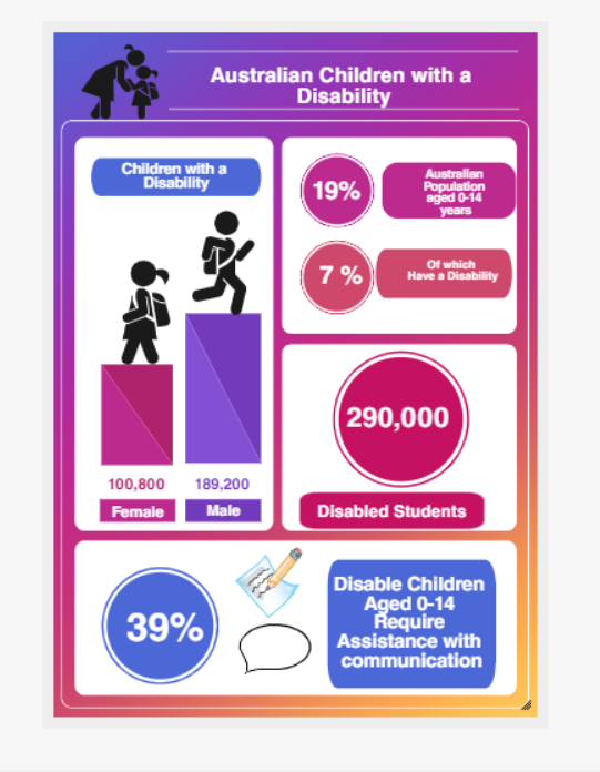
It was not until I had completed this infographic that I was able to look at the end product and saw it through the eyes of the audience. Even though this information is essential, the key information that I wanted the audience to receive was a little lost, i.e. that 39% of children with a disability aged 0-14 require assistance with communication. I needed this information to be higher in the infographic, bolder and more prominent.
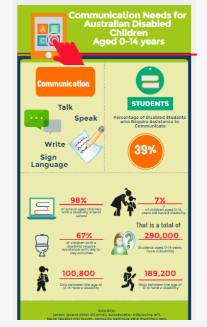
So, when I started to design my second infographic. This time I had my key message and the audience in mind. So, I set about to make sure my message was more apparent and was emphasised. I am happier with this infographic.
References:
Column Five (27th September, 2011). The Value of Data Visualisation. Retrieved 17th May 2019 from https://vimeo.com/29684853
Australian Bureau of Statistics (ABS).(2009). Disability, Australia, 2009. Retrieved 10th May 2019 from https://www.abs.gov.au/ausstats/abs@.nsf/mf/4446.0
Australian Curriculum Assessment and Reporting Authority (ACARA). (2017). Australian Curriculum: F-10 curriculum: Technologies: Digital Technologies. Retrieved 17th May 2019 from https://bit.ly/2z9PE7K

Melinda this is a great blog. You write very clearly and it is easy to understand your thinking process. I really like both of your infographics. The first one has very eye catching colours and clearly displays your information. I agree that the second one clearly displays the most important information and the eye is drawn to this very quickly. As usual, well done!!!
LikeLiked by 1 person
This is a great post, Melinda. I really felt that you shared the data on Australian Children with a Disability in a colorful, informative and engaging way. Your statistics are wonderful and I certainly feel like I know a little bit more about the topic from reading this post. Well done!
LikeLike